Print Advertising: The Good, the Bad and the Ugly

In print advertising, artwork is the initial impression that consumers have of your business or product. It’s the first step in gaining the attention of the buyer you are trying to sell to. That visual typically is the difference between if the person decides to pay attention to the pieces of your advertising- the verbiage, the product or service itself, and the offer, or moves along to what captures their attention next.

Almost every day I have conversations with business owners and decision makers who ask about how their artwork should look. It’s an important question and comes up so often because many people just aren’t sure how to go about it. Most people (including me) know what they like when they see it but don’t know how to express that verbally or artistically. That’s ok though, and the reason why my company employs very talented and artistic designers. I trust them implicitly because they’ve proven their professionalism with our clients consistently through the years. And they’re not just artists, they know what works and what consumers like.

With that being said, I have learned from many years of experience the difference between good and bad artwork:


Good

– Simple clear message

– Holds interest

– Stong call to action


Bad

– Requires the reader to work hard

– Missing attention-getting elements

– Can’t tell what you are really trying to offer


Ugly

– Full of clutter

– Low-quality images

– Overuse of color and fonts

(Graphic Designers nightmare)


Avoid the temptation to include every product or service line you offer in your ad. Don’t make the prospect have to think about or evaluate everything and the kitchen sink you threw in there. They don’t want to think and they’ll ultimately move past your ad and forget all about you. Tell your prospect we are Acme Company, we make your life better, and do it for 40% off. That’s it.

If you’re worried about leaving out something you think might be important then include your website address. If the prospect wants or needs more information they will gladly take the time to visit your website and learn more about everything you do and why it’s important to them. Your website is your encyclopedia, your print advertisement is not.


Contributed by Jeff Vice

Teamwork Gets It Done!

Image1

When I started working at RSVP at 2012, we only offered one program – our Luxury Card Pack – and only mailed in 10 zones throughout Ohio & Kentucky. At that time, I was the only graphic designer and I easily kept myself organized with just pen and paper: writing out to-do lists, sketching ideas, and making notes for myself. In 2013, RSVP quickly started growing, adding several new programs to create an entire marketing suite, as well as acquiring 2 new zones in Indianapolis – bringing our total coverage to 12 zones in 3 states. Before I knew it, I was swamped! Two things immediately became clear:

  1. I realized that we needed to hire a second designer, not only to help manage the workload these exciting changes brought about, but also to enable RSVP to continue to grow.
  2. I also realized that my-pen-and-paper method of organization & project management wasn’t going to cut it any more!

In December 2014, we hired a 2nd graphic designer, and though the workload remained demanding & hectic, I knew we could manage it if we worked together & developed a coherent strategy.

Image2

So how do we do it?

  1. We set clear goals and tasks: Each of our programs has a set-in-stone deadline, so staying on task & on track is essential! We make this happen by using project management software to schedule and manage tasks. This helps us work as a team & take big projects in small chunks – it can be overwhelming to see something like 36 mailings due in a single month! But by breaking it down bit by bit. we find it’s much less stressful and daunting. We each excel at different aspects of design, too, so the software allows us to collaborate – and to come with the best solution for each client.Image3
  2. We expect the unexpected: It’s inevitable that something goes wrong – a computer crashes, or a client changes the artwork, or someone gets sick. No matter how much pre-planning we do, we know that something always comes up. The key is to stay calm & cope with whatever the situation may be.  We stay flexible by getting work done early & doing our best to anticipate possible speed bumps. Image4
  3. We measure our successes and celebrate our victories: When you manage a project for efficiency, accuracy, and speed, it’s not just about managing the details and flow of the project; it’s also about managing the details of the details. Every morning, we come with a clear plan of action, enumerating what needs to be done that day, how we’re going to get it done, and we make sure to check off each task along the way. At the end of the day, we evaluate what we have accomplished, and then plan accordingly for the next day. Image5

We know that RSVP’s success is our success & vice-versa, so we’re excited to continue growing & know that we will be able to manage our projects as long as we stay focused & committed to excellence. We won’t stop until we reach the top!Image6


Contributed by Caitlin Tuohy. All images are the author’s own & may not be republished without express written permission.

Caitlin


This Week in Advertising: Feb. 15 – Feb. 21

Welcome back to RSVP’s This Week in Advertising feature! This regular series includes the news tidbits from the advertising world that interested, excited, or amused us this week. We’re glad you’ve joined us – let’s see what happened This Week in Advertising:


  • Let’s kick off with a quick lesson in what NOT to do when your company is on the receiving end of some backlash: Seasalt & Co., a company specializing in Photoshop tools, posted a bizarre ad featuring an ominous-looking tree with an even more sinister noose dangling from one of the branches, ostensibly to promote their latest line of graphic design tools…somehow. When the responses they received were less than flattering, the company began threatening legal action against those who complained, then eventually deleted their social media accounts, only to resurface later, with their Facebook page scrubbed clean of the ad, the responses to the ad, and any reference to the ad. A halfhearted and confusing apology (predictably) soon followed, and we suspect the clean-up will continue in coming months. The moral of the story? Think before you advertise, and take criticisms to heart – preferably without unnecessary legal threats.
  • At the other end of the tact spectrum, online retailer ModCloth is known not only for selling high-quality clothes in kitschy cuts & prints at affordable prices, but also for promoting realism & body diversity in their advertising – they were the first company to join a pledge against using Photoshop on their advertisements to create “unattainable body images,” and the company frequently uses images of everyday customers wearing their clothes in catalogs. They continue this tradition with their 2015 swimwear campaign, which features actual ModCloth employees instead of models. The ads include women of various heights & shapes, and have generated quite the social media buzz on Facebook, Twitter & Tumblr.
  • ModCloth may not care much for Photoshop, but millions of graphic designers the world over do, and use the program to design & create the eye-catching ads we see in our daily lives. Adobe is celebrating its iconic design program’s 25th anniversary with a vibrant 60-second ad set to Aerosmith’s “Dream On”, which will air during the Oscar Awards this Sunday evening.
  • Oh, did we mention the Oscars are on this Sunday? You can prepare for the big night by watching the stirring, emotional ads the Academy developed to promote Sunday’s show – just have some tissues ready.
  • Oscar-night ad spots are as coveted as those nestled in between plays on the Super Bowl, and American Express alone will be airing four ads, each costing the credit card company around $2 million dollars. These commercials will feature various celebrities – who are also AmEx clients – talking about their rises to fame & overcoming the obstacles that stood in the way of their dreams…dreams that are now worth $2 million dollars.
  • We know this isn’t *technically* advertising-related, but we can’t help but be fans of Mad Men, the hit AMC show that has transfixed millions over its seven-season run. The show, set in the dog-eat-dog world of 1960s advertising firms, begins its final season on April 5th, and the first trailer indicates that the swinging-sixties have given away to a very sideburn-ed & plaid seventies. Catch the spot here, and be sure to tune in to AMC on April 5th – it’s certain to be memorable.

    Contributed by the RSVP Staff
    599989_490444994334164_1259671619_n

Say What? Part 2

What do you mean it’s lo-res?lo res

Resolution for print images and web images are extremely different! Resolution in basic terms is the size of an image. It’s the density of dots that make up the image when printing. The bigger the resolution, the more detailed it is. The lower the resolution, the less detailed. Web images have a resolution of 72 dpi (dpi – dots per inch), while print images require a resolution of 300 dpi.

The goal of an image on a website is to get it to load fast. It’s useless to have massive images on your website when it takes forever to load.

So by using a 72 dpi image from a website and then trying to enlarge the image for print will not work. Photoshop will have to guess what pixels to fill in the gaps with extra color, which is why your image will print out fuzzy. Unfortunately the only real solution if you want a professional look is to get a different picture. Resizing a document down is okay however, as we’ve already got more than the amount of pixels we need.

Don’t try to trick the system. A lot of magic can happen in Photoshop, but creating pixels out of thin air isn’t one of them.

Click here to learn how to check the dpi of your picture.

Submitted by Caitlin Tuohy.

Caitlin

Say What? Part 1

This is a three part series from a designer’s point of view as it relates to artwork questions, processes and overall curiosities. 

They say, “A Picture is Worth a Thousand Words” but is that picture really worth a $3,000 fine?

One of the most common questions I hear in the design world is “Can you use this image I found on Google?” The answer is no. Just because an image is on the internet, it doesn’t mean the image is free to use. You still need the correct license to use it. There is a difference between an stockpicimage being online and an image being public domain.
Copyright infringement can result in lawsuits and costly legal fees.

 New technology now enables copyright owners to easily identify unlicensed imagery and act to protect their rights. One of the safest and best options is to purchase stock photos where you can find a wide variety of photos for your specific needs.

Stock images break down into two types, royalty-free and rights-managed. Royalty-free images, you get nearly unlimited use. Rights-managed images, your right to use the image is typically restricted, with limitations placed on things such as duration of use, geographic region, industry, etc., as established by your license agreement.

Keep an eye out for the next two most common questions in the coming weeks!

Caitlin

Thoughts from a graphic designer….

WhatTheFont


What is a font?

A font is the collection of characters.


What is a typeface?

The design for a set of characters.


A typeface is not font. A font is not a typeface.


Confused yet?


The term font is often used as a synonym for typefaces, which is not technically correct. For most people who are not in the design world, they only think of about fonts when choosing one in Microsoft Word. The two terms frequently cause some confusion to those unfamiliar with the difference.


Typeface = a type family’s design

Think of a typeface as a set of characters of the same design. A typeface is the ‘design’ of the design of the alphabet, the shape of the letters that make up the typestyle. Typefaces describe the overall look of the characters.


Font = one member of a type family

A font, on the other hand, is traditionally defined as a complete character set within a typeface, often of a particular size and style. Fonts are also specific computer files that contain all the characters and glyphs within a typeface.


A typeface is like a jukebox while font is the tunes inside.


ITC Bodoni


Contributed by Caitlin Tuohy.
Caitlin

The History of the Chocolate Bunny… and other Easter Traditions

EasterTargetPic

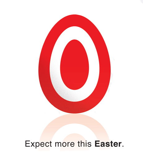
This is just one example of Easter ad’s from years past. You’ll find a lot more by clicking on this picture!

When spring arrives there is a lot to look forward to like warmer weather, brighter colors, beautiful flowers, and of course Easter!! One of the most celebrated holidays, Easter is among a favorite of many. It is observed here in the states and across the world.

An Article in Women’s Day Magazine called ‘Easter Traditions from Around the World’, shares that

“In some parts of Western Finland, people burn bonfires on Easter Sunday, a Nordic tradition stemming from the belief that the flames ward off witches who fly around on brooms between Good Friday and Easter Sunday. In Rome, Mass is celebrated on the evening of Holy Saturday, and on Easter Sunday, thousands of visitors congregate in St. Peter’s Square to await the Pope’s blessing from the church’s balcony, known as “Urbi et Orbi” (To the City and to the World).”

My favorite tradition is in France.

“Each year a giant omelet is served up in the town’s main square. The omelet uses more than 4,500 eggs and feeds up to 1,000 people. The story goes, when Napoleon and his army were traveling through the south of France, they stopped in a small town and ate omelets. Napoleon liked his so much that he ordered the townspeople to gather their eggs and make a giant omelet for his army the next day.”

Here in the States we have our own Easter traditions that we look forward to each year. For example, the Easter Bunny coming to everyone’s houses with Easter baskets, coloring eggs, hiding the eggs, and of course the chocolate bunny! The question is though how did we come up with these Easter traditions? Being of German heritage I was fascinated to find out that the Easter bunny originated among German Lutherans. It was used to judge the behavior of children during the Eastertide season much like Santa Claus at Christmas. If the children were good throughout the year the Easter bunny brings candy and colored eggs.

Wikipedia says that the “The custom of the Easter egg, however, originated in the early Christians of Mesopotamia, who stained eggs red in memory of the blood of Christ, shed at his crucifixion. The Christian Church officially adopted the custom, regarding the eggs as a symbol of the resurrection. Easter eggs are also a widely popular symbol of new life in Bulgaria, Poland, Romania, Russia, Ukraine, and other Central European countries.”


As for the delicious chocolate bunnies that children around the world receive in their Easter baskets… well those started during World War II. A Foodimentary article says that “the chocolate bunny can be searched back to the 19th century as a by-product of World War II coco rationing in Germany.”

SweetCityCandy.com reports that, “Americans buy more than 60 million of these chocolate bunnies each year, which undoubtedly makes Easter one of the biggest candy-eating holidays.” Big holidays such as Easter, Thanksgiving and Christmas use the holiday to promote their product. Many large corporations such as Target, M&M’s and Subaru have used this holiday in their marketing campaigns.Easter

I hope you all get chocolate bunnies in your baskets and that you all get to celebrate your own traditions with family and friends! Have a very happy Easter everyone!


Contributed by Crista Kling.

Crista


Sources:

http://www.womansday.com/life/easter-traditions-from-around-the-world-105074

http://en.wikipedia.org/wiki/Easter_egg

http://foodimentary.com/2012/04/03/a-history-of-chocolate-bunnies/

http://www.1designperday.com/2013/03/11/45-most-creative-easter-advertisements/